Role
Team
The context
Mailjet is Sinch's email marketing product, used by marketers to create and send campaigns. The AI team had shipped a first version of an AI writing + chat assistant inside the campaign editor, but it was missing rich content generation, the ability to produce full email templates from a prompt rather than just rewriting existing copy. That was the gap the team set out to close.
I joined after v.1 was already live, which shaped how I approached the work: before designing anything new, I needed to understand what was already there and what it was actually doing to users.
Starting with an audit
The first thing I did was a thorough audit of the existing AI experience: not just the UI, but how it fit (or didn't) into the broader context of the editor. Mailjet was in the middle of a significant revamp of its campaign editor, which created both a constraint and an opportunity: we couldn't rebuild everything at once, but we could be thoughtful about what we prioritized.
The audit surfaced a set of quick wins, places where the experience could be meaningfully improved without waiting for the full editor redesign:
pre-made prompts to reduce the blank-page problem, better explainability and transparency around what the AI was doing, cleaner select-edit behavior, and UX pattern simplifications that would bring the experience closer to tools users already knew.
Shipping these improvements early let us introduce rich content generation without having to hold it back until the full interface rebuild was done. We could test earlier, get signal sooner, and catch any real failures before they were baked into a larger release.
The feedback on these changes was quiet: minimal friction, low complaint rate. That's sometimes the right outcome here, not every design change needs to announce itself.
Defining the AI interaction model
With the quick wins shipped, I turned to the larger question: what should the AI experience actually be in a rebuilt editor?
An email editor is a high-stakes, execution focused environment. Marketers using Mailjet arenot exploring open ended ideas most of the time… they're refining, adjusting, and shipping. They're accountable for brand voice, compliance, and performance. That context is important for AI design.
My core principle for this work: AI should adapt to user intent and context, not ask users to adapt to the AI.
In practice, this meant rejecting a single dominant paradigm.
Chat-based AI works well when the problem is ambiguous and the output space is large, but most editing actions in Mailjet are local and well defined. Asking someone to explain in a chat interface what they want to tweak in a CTA is heavier than it needs to be.
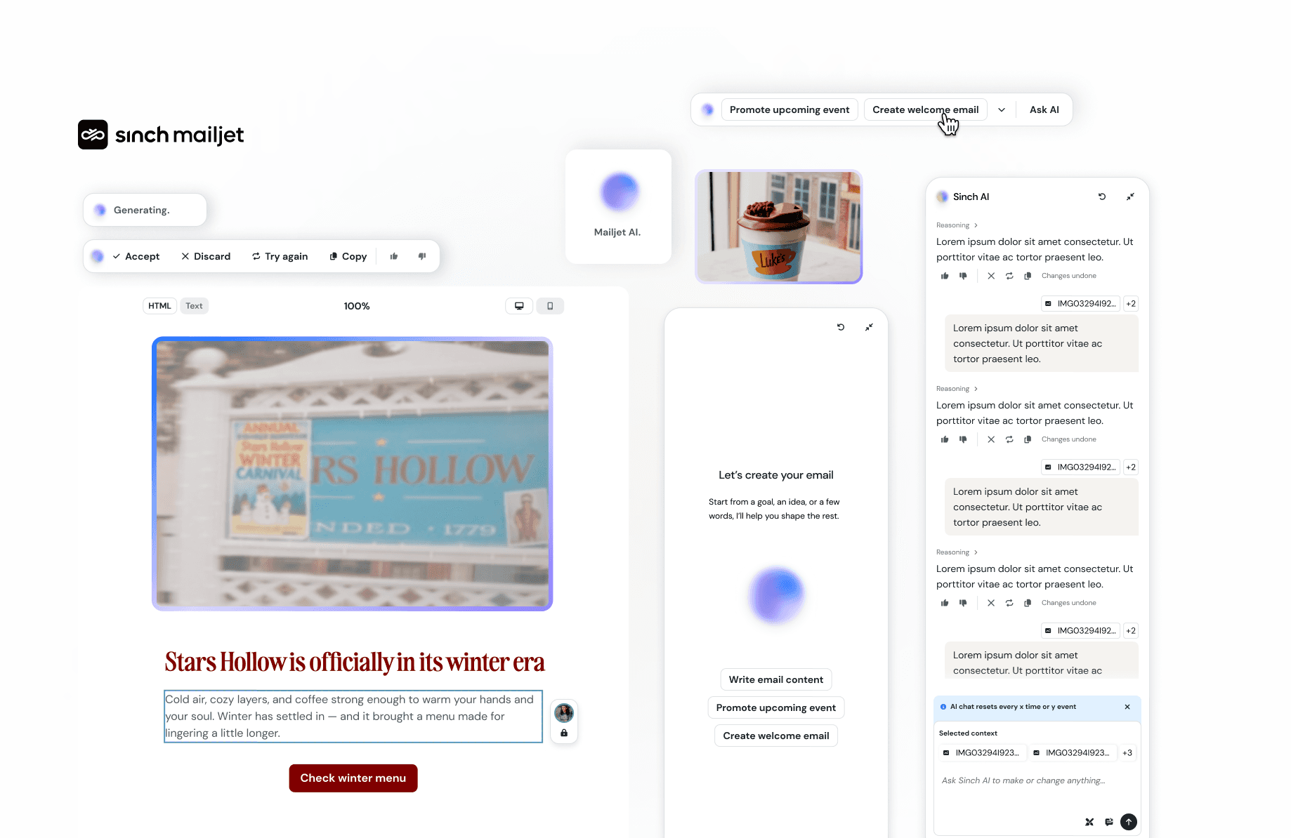
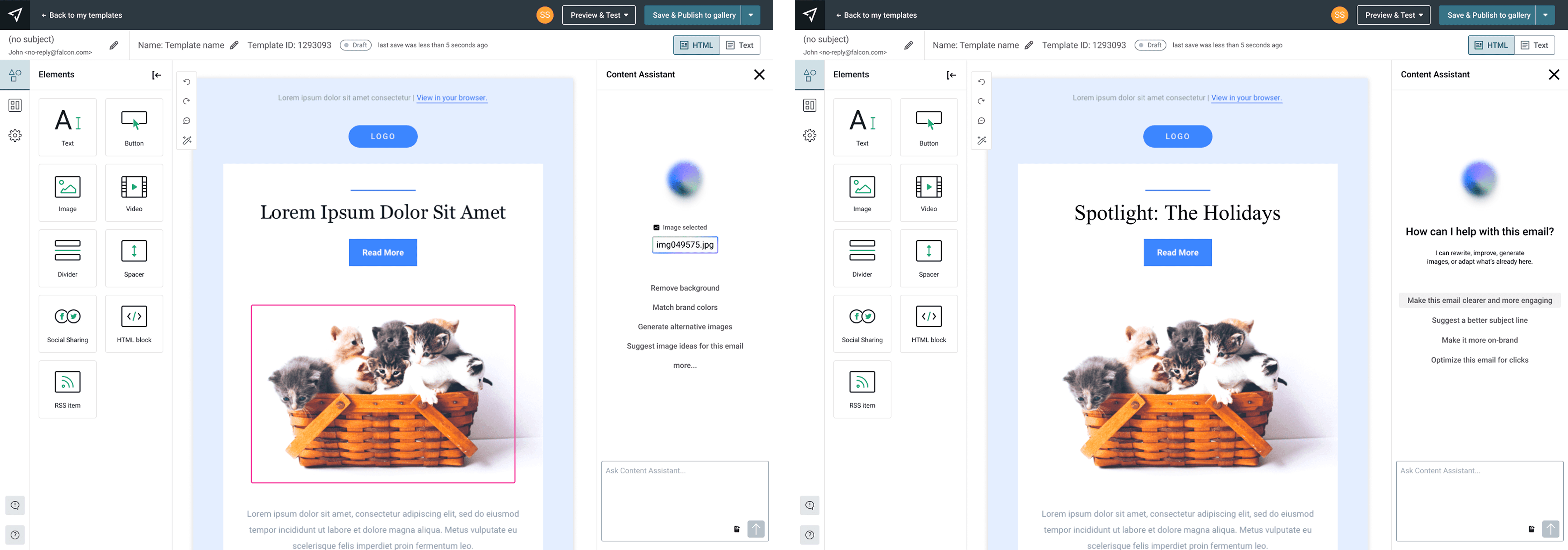
The model I proposed and designed was a two-mode system: contextual/inline AI as the primary mode: AI living close to the content it affects, triggered by selection, with clear scope and reversibility,
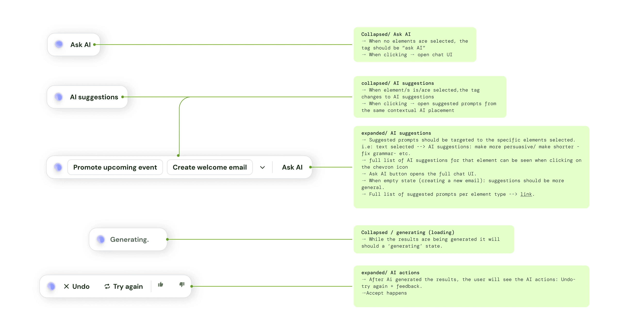
and a scoped chat as a secondary mode for blank-page moments, generating first drafts and exploring structure, but always producing outputs as drafts rather than auto-applying changes. The distinction between when each mode surfaces, and how the transitions between them work, was a significant part of the design work.
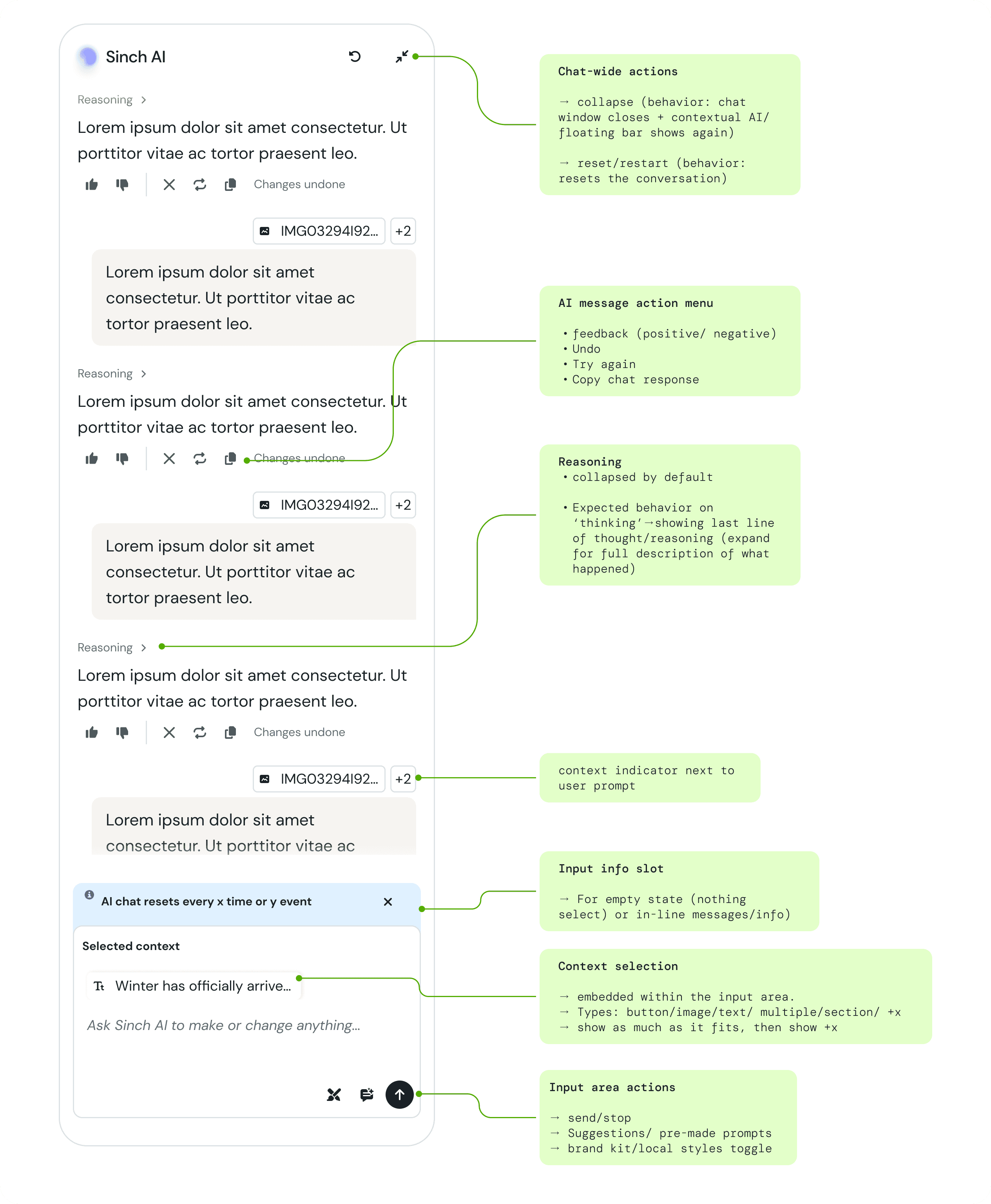
I designed all the UX patterns for this system: how the chat surfaces, how inline editing behaves, what happens when a user selects a block, how transitions between modes work, how the experience handles the shift from contextual to generative and back.

Working with engineers on output quality
A meaningful part of this project happened outside the interface. The v.1 outputs, the actual AI-generated email templates were noticeably dated and inconsistent. The design standards weren't reflected in what the model was producing.
I worked closely with AI and ML engineers to improve this. We analyzed what made a good email template from a design perspective: visual hierarchy, typographic simplicity, adaptability, how a user would actually customize it, and translated those criteria into stronger system prompt guidance.
We ran test cycles, evaluated outputs against the criteria, identified where the model was still falling short, and iterated. It took several rounds before the results were reliably good.
It's a less visible kind of design work, but the quality of the AI output is part of the user experience. Getting it right was important to grant the success of what we were working on.
Creating a new visual identity for AI features
I developed a distinct but coherent visual identity for Mailjet's AI experience, which I then shared with the broader Sinch brand team as a potential foundation for a company-wide AI design language.

This project is currently in implementation and is expected to go live in H2 2026. Live prototype of the full editor experience here.
What I learned
Joining a project post-v.1 is its own thing.. The impulse is to redesign everything, but the right move is usually to understand what's already working, build on it, and create space for bigger changes without blocking what needs to ship. The audit-first approach let me do that, and meant the RCG feature could reach users faster than if we'd waited for a full rebuild.
The other thing that i take away: If the output is bad, the interface doesn't matter. Getting involved at that layer, and understanding it well enough to have real conversations with the ML team, made the final product significantly better!.